COLOR THEORY PROJECT
Color is one of the most important design elements. Color Theory is understanding how colors interact with one another and what can be achieved with colors in a design. Colors have complex interactions with one another. Learning how color can change, enhance, or alter a design is very important for a designer.
Vocabulary
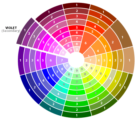
Color: Has three properties: Hue, Value, and Intensity.
Hue: is the name by which a identify a color.
Value: is the degree of lightness or darkness in a hue.
Intensity: is the measure of brightness and purity in a hue.
Hue: is the name by which a identify a color.
Value: is the degree of lightness or darkness in a hue.
Intensity: is the measure of brightness and purity in a hue.
|
BACKGROUND DESIGN
The background design should meet the following criteria: outlined with a thin black pencil tool, a geometric design or pseudo geometric design that draws attention to the page, 7.5 by 10 inches, 300 resolution, and created in Photoshop.
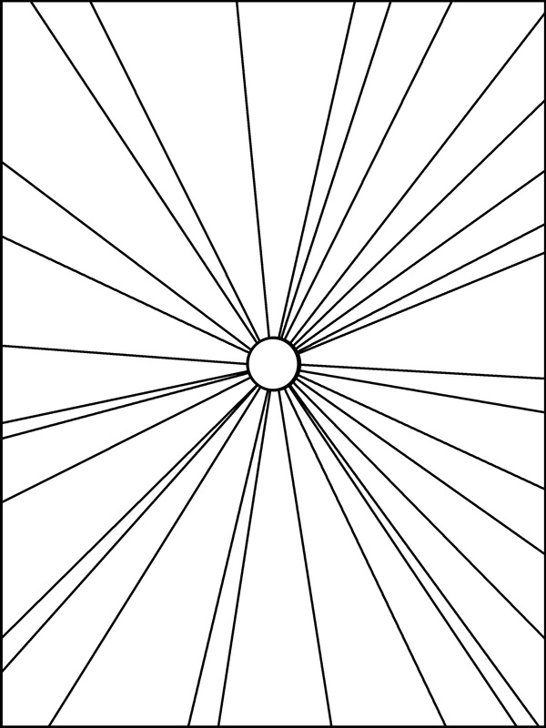
When working with the pencil tool you should use a brush size of 9 or 13. It is not required but I would suggest drawing a thin border around the outside edge of your background design. This thin border will help keep colors from filling up other sections with the wrong color. Make enough spaces in your design so you can show the color scheme yet not so many spaces in a design that you are troubled with being able to complete each color scheme. A good amount is between 30 to 40 spaces. |

|
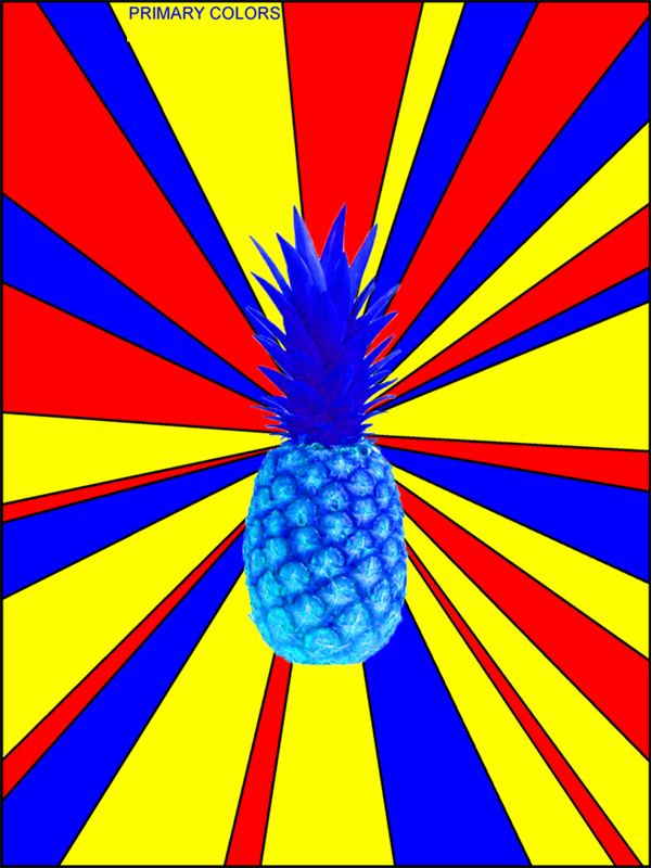
OBJECT
The object from the Internet should be appropriate for school, sized to fit onto the page, chosen to integrate with the background design, have vibrant colors in the image, it can not be a design that another person created, and display some personal significance.
|
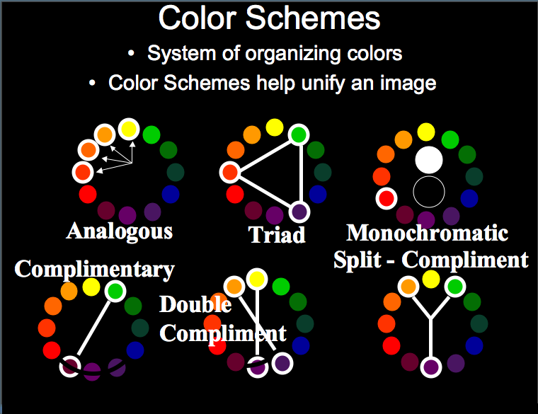
COLOR SCHEMES
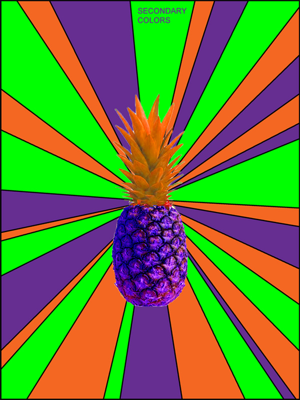
The color schemes working document should meet the following criteria: nineteen different color schemes on nineteen different layers, each layer box and color scheme should be labeled with the correct color scheme name, the correct colors should appear on each layer for each of the color schemes, the object from the Internet should be integrated into each color scheme layer by altering the color in the adjust menu, and use the nineteen color schemes listed in the sections below.
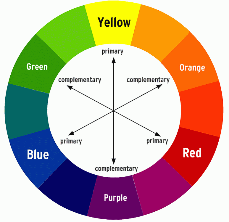
PRIMARY COLORS
Definition: Colors from which virtually all other colors can be mixed.
RED, YELLOW, BLUE 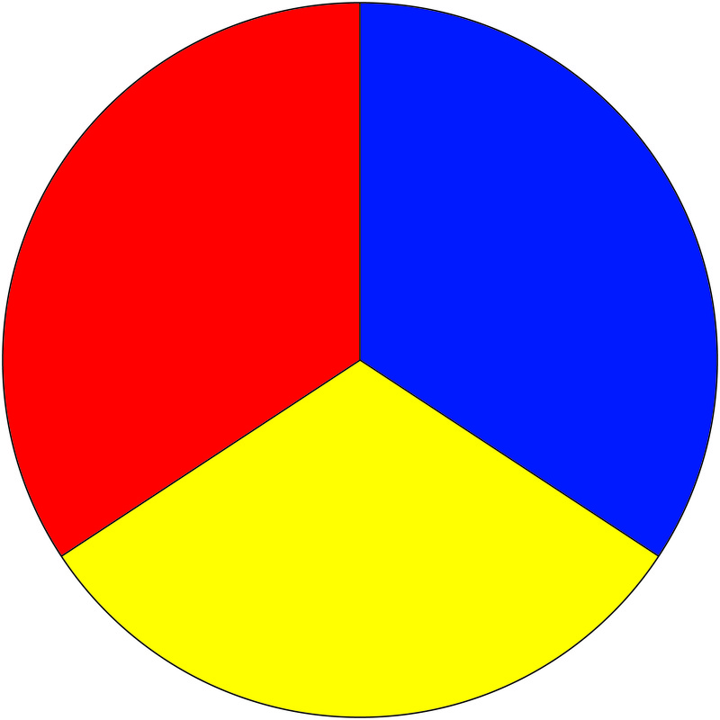
|
|
|
SECONDARY COLORS
Definition: Hues mixed from adjacent primaries.
GREEN, ORANGE, VIOLET 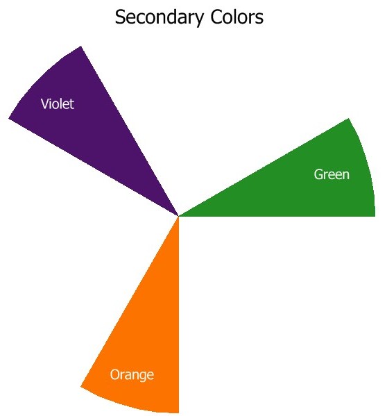
|
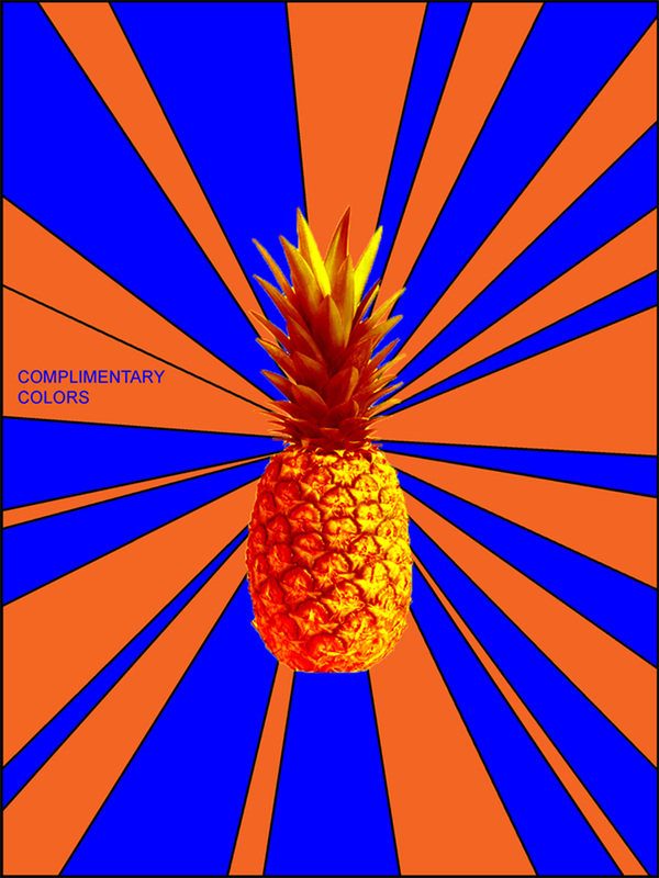
COMPLIMENTARY COLORS
Definition: Hues that are opposite each other on the color wheel. When complimentary colors are matched together in a composition they create contrast. When complimentary colors are mixed together they make a wide range of browns.
|
|
|
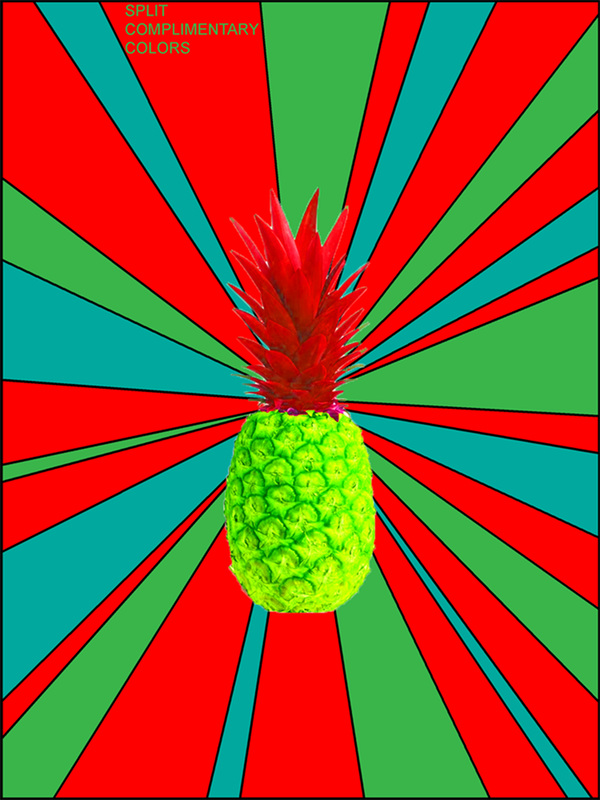
SPLIT COMPLIMENTARY COLORS
Definition: A complimentary color plus the two colors on either side of its compliment on the color wheel.

|
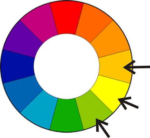
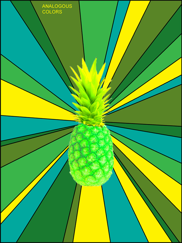
ANALOGOUS COLORS
Definition: Three hues that are adjacent on a color wheel. Adjacent means right next to each other.
|
|
|
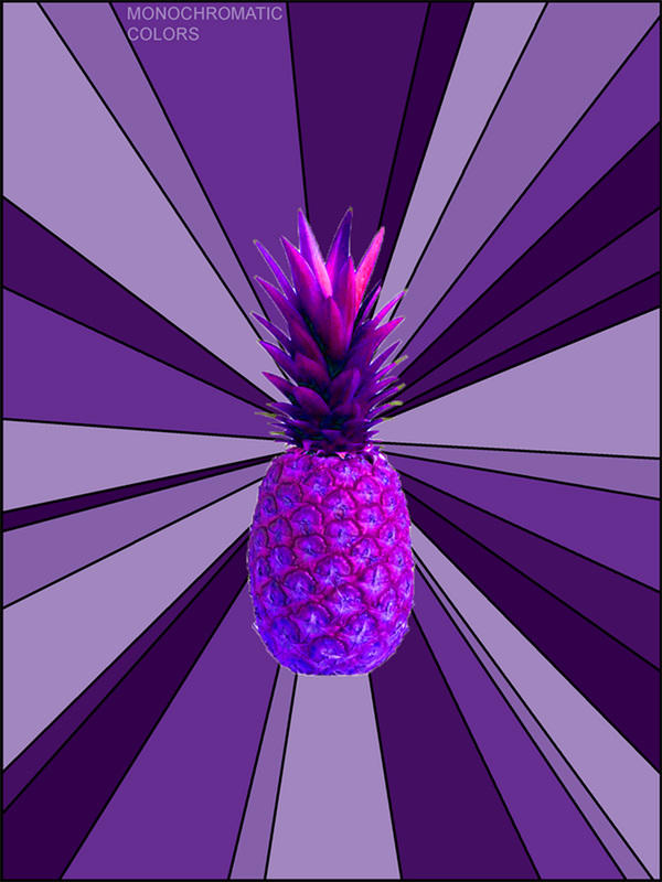
MONOCHROMATIC COLORS
Definition: Variations in a single hue. There can be as many variations on that single hue. All the way from light violet to dark violet and any thing in between.
|
|
